I am doing my own personal project so if I get selected for an interview I will show them this project as my up to date work. This project shows how words have power and meaning. I have written a poem and I will then select a few words out of that poem to portray on postcards.
My Poem Untitled
"Are you okay?"
"I'm Fine..."
The truth was I wasn't fine, I was breaking inside.
Hope was fading, all chances that I thought I had was shattered on the floor in front of me.
I headed for the only way out, the door but as I grasped the handle I slipped, and fell and I kept falling.
I felt like I was spiralling in to the abyss.
It was dark, cold and loneliness was my only friend there to comfort me.
I closed my eyes tightly,
I wanted this to be just another nightmare and for me to wake up in the safety of my home
It wasn't.
When I plucked up the courage to open my eyes a light flicked in the distance.
It grew brighter and brighter as I kept falling drew nearer and nearer.
I hit the ground with a crack.
I couldn't stand, all energy that I had was burnt out.
I took a deep breath the air was no longer musty, It was fresh.
The light around me was bright and vivid and everything looked natural.
I crashed back to humanity.
I was greeted with the beauty of the world and it never looked better.
The have chosen a few words to possibly portray..
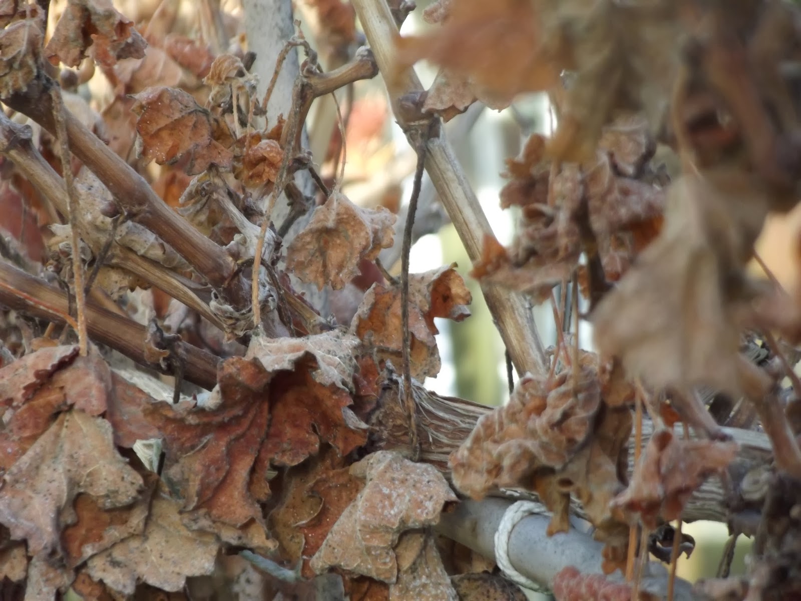
- Fade
- Abyss
- Shattered
- Broken
- Loneliness
- Burnt out
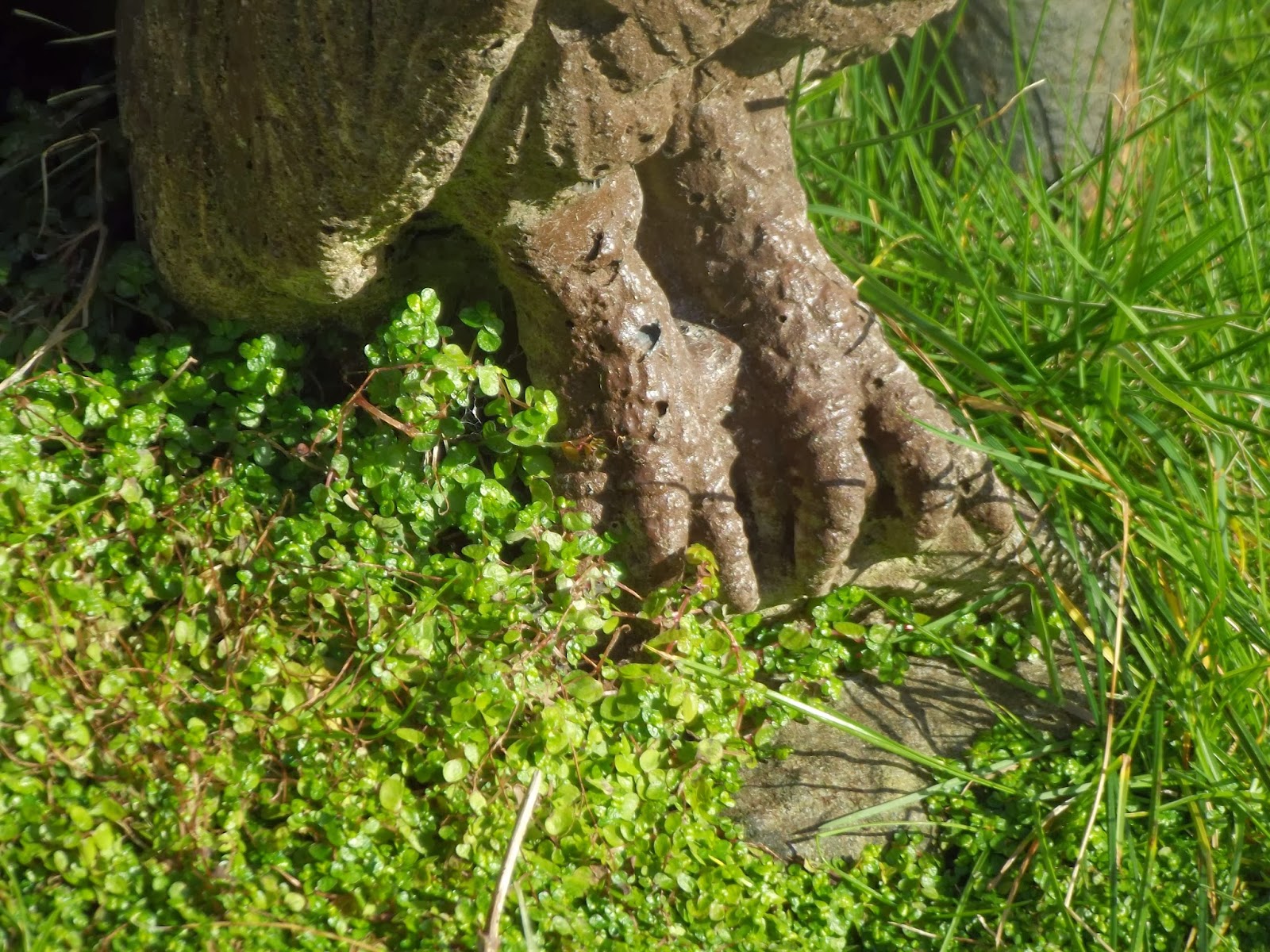
- Vivid
- Natural
- Humanity
- Light
- Beauty
I will now look for artist research to see how artists portray words into their work and if they have given them power.